Designing Neo Pepe is an exercise in making a system that feels handmade. The identity has a face, but the real magic is the kit around it: icons, color fields, textures, and motion rules that let us remix the look without losing the thread. A tour requires a visual language that is easy to deploy at speed and resilient to all kinds of venues, printers, and screens. Our solution is a modular set that travels light and adapts fast.
The core symbol is a grin tilted a few degrees off-center. It reads playful and a little mischievous, a signal that this is art with a wink. We pair the grin with geometric eyes that can scale from tiny favicon to billboard without losing personality. Around the face is a library of glyphs that reference road signs, sticker culture, and classic type ornaments. We keep the line weight consistent so that everything feels cut from the same sheet, and we limit angles so compositions harmonize.
Color is where the tour gets loud. Our base palette is neon green, soft black, warm white, and a rotating accent tuned per city. The accent comes from a local image: the terracotta roofs of a hillside, the ultramarine of a coastal tram, the sun-faded red of an old cinema. We pull a swatch, test it against the neon, and adjust saturation until the pairing hums. This per-city accent makes posters collectible and helps locals feel seen. It also keeps the feed fresh without abandoning recognition.
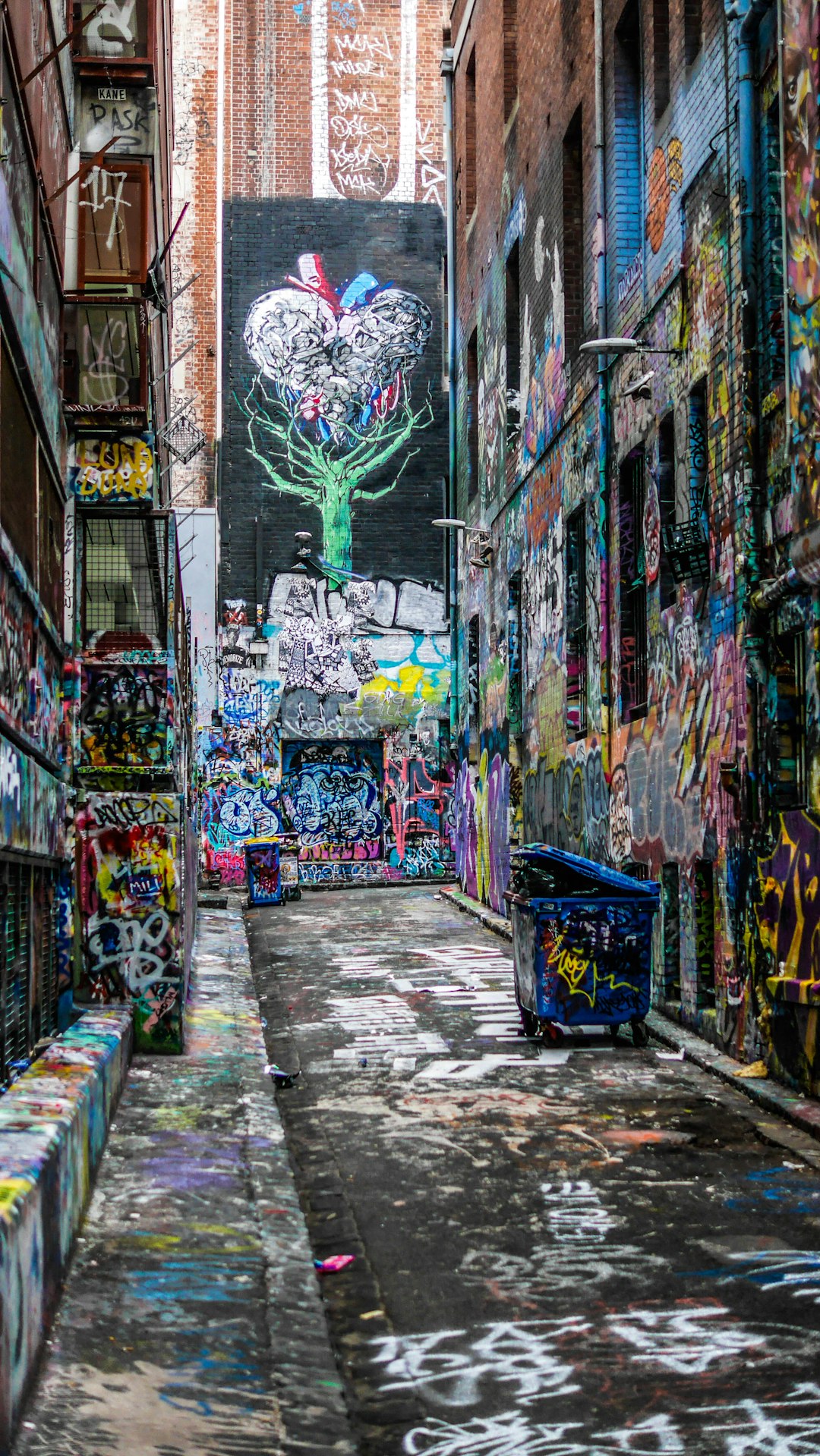
Textures keep the work from feeling too digital. We scan paper fibers, tape shadows, and ink bleeds, then compress them for quick use in print and motion. On screens, we fake parallax with slow, confident moves that echo stage lighting rather than app transitions. The motion system is built on three verbs: slide, blink, bounce. Slide is for reveals and transitions. Blink is for tiny emphasis, quicker than a dissolve but gentler than a cut. Bounce is sparing, a celebratory gesture that suits call-and-response moments in videos.
Typography is a two-part duet. A friendly grotesk handles body copy for clarity. A chunky display face carries headlines and numerals that look fantastic on posters and setlists. We design numerals with the same mischievous tilt as the grin, so even a time or date can feel on-brand. Kerning is a sport for us; we tweak it per word to keep the rhythm musical. Accessibility matters, so we test contrast on every background and build a high-contrast alternate for venues with dim or colored light spill.
The beauty of a system like this is that it invites participation. We publish a mini kit to local collaborators with do’s and don’ts that are simple and generous. Do pair the grin with local accent color. Do use textures to soften flats. Don’t stretch the face. Don’t rotate the grin beyond its tilt. Within those lines, there is room for endless riffs. That is the point. The identity is a melody, not a script. When the city adds its verse, the song gets better.
And because we travel, we plan for failure. Printers jam. Projectors stutter. A fog machine eats contrast. Our assets include fallbacks and high-contrast alternates. We preflight files for common hiccups and carry a small kit with tape, markers, and a thermal labeler that has saved more than one merch table. The goal is not perfection. The goal is a look that loves the road and looks back at you with a grin that says, we can make it work anywhere.

